The Lay of the Land
Mapmaking is showing that geography may rival genetics as an indicator of human health
- 12 minute read
- Feature

John Snow’s 1854 map depicting cholera cases in London that year.
There is something fundamental about a map,” writes New York Times journalist John Noble Wilford in The Mapmakers, a history of cartography. Maps can excite the imagination, instill a desire to explore, and distill the physical connections between people, places, and things.
In various forms, maps have been in use for more than 5,000 years. Indigenous peoples of the Pacific islands used stick charts to navigate their way across the vast waters; early Inuit people carved detailed representations of their home coastlines from wood; and the Incas made clay and stone relief maps of their mountainous empire.
Today, vast quantities of data from satellite imagery, drone photos, and an increasing array of sensors are aggregated and tied to geographic coordinates that can be mapped and analyzed visually. Recent advances make it relatively simple to animate series to show how data move across a mapped region over time.For researchers, population health workers, and clinicians, maps have become critical tools for analyzing data and communicating the results of that analysis to key audiences: policymakers, the public, and other researchers. This is especially important because so many risk factors for both infectious and noncommunicable diseases are tied to specific places. Where you are and where you have been play important roles in whether you get sick or stay well. Fortunately, digital cartography, remote sensing, social media, mobile communications, and other technological advances have made it increasingly feasible to develop maps that can be used in efforts to fight epidemics and promote well-being in real time.
On the dot
A cascade of red dots representing reported cases of tuberculosis seems to spill off the edge of a map of neighborhoods in Carabayllo, a municipality in Greater Lima, Peru. The community has developed so fast it has outgrown the census blocks that were meant to define it.
The map doesn’t just show the fast pace of urban growth in Peru. It illustrates the importance of having a high-resolution visual of the geography of tuberculosis. The map shows percentages of households with the disease. Some census blocks are lightly shaded, indicating relatively few cases, while others are saturated with color. In those areas, the incidence of the disease is five times greater than the national rate.
In Carabayllo, a team led by HMS researchers and Peruvian collaborators has begun a new project to use mapping technologies to target tuberculosis-eradication efforts as precisely as possible and to help build community engagement and participation.
“We have to think of tuberculosis epidemics as local,” says Mercedes Becerra, an HMS professor of global health and social medicine and one of the leaders of the Carabayllo initiative. Becerra, along with Salmaan Keshavjee, PhD ’98, an HMS professor of global health and social medicine, is a founder of the Zero TB Initiative, an international collaborative working with local coalitions to test and refine comprehensive treatment and prevention protocols to rapidly drive down tuberculosis rates.
The goal of the initiative is to create “islands of elimination,” geographically defined regions within which no tuberculosis deaths or cases occur. Some of the initiative’s collaborating sites will be on actual islands, others in discrete regions within cities. The initiative is infused with the importance of geography; it uses language that emphasizes location and focuses outreach on communal social spaces where many people at high risk of tuberculosis infection are likely to meet.
The Zero TB Initiative in Peru involves clinicians and researchers from HMS, Brigham and Women’s Hospital, Partners In Health, and a number of Peru’s community and government organizations at the local, municipal, and national levels.
Meredith Brooks, an HMS research fellow in global health and social medicine, is working with Becerra to create maps that combine data from municipal and federal records and from a local epidemiologic study conducted from 2009 through 2012 by a team led by Becerra and Megan Murray, MD ’90, the Ronda Stryker and William Johnston Professor of Global Health at HMS. The study gathered information about social, economic, and environmental factors in homes affected by tuberculosis.
Brooks’s maps are scaled at the neighborhood level and will be used to guide an intensive effort to search for, treat, and prevent tuberculosis in the hardest-hit parts of Carabayllo.
We want to learn to use these data in real time, so we can respond to the disease where it’s happening now.
“The goal is to do more than make nice maps that show what happened with the epidemic historically,” Brooks says. “We want to learn to use these data in real time, so we can respond to the disease where it’s happening now.”
The researchers plan to use maps in outreach efforts with community coalitions to illustrate the strength of the tuberculosis epidemic in specific zones and to highlight the local availability of treatment and prevention services.
Well, well, well
Although maps have been around for millennia, what we might recognize as data maps appeared comparatively recently. Edward Tufte, a statistician and well-known analyst and theorist on the presentation of data in visually comprehensible formats, notes that certain methods of displaying quantitative evidence are better than others: Good graphics are more likely to produce credible and precise findings and are more efficient than most other means of conveying data. He notes that a single data-rich map is capable of wrangling millions of bits of information into one easily deciphered display.
“No other method for the display of statistical information is so powerful,” Tufte writes.
How powerful can be seen in the medical data map in On the Mode of Communication of Cholera, published in 1854 by John Snow, an English physician whose work is considered to be foundational to epidemiology. In his map, Snow overlays locations of cholera deaths and locations of public water pumps on a street map of Soho, then a suburb of London.
At the time, it was thought that cholera was transmitted by tainted air, but Snow suspected that the disease flowed from contaminated water. To gather data to either support or refute his notion, Snow went door to door to the homes of the deceased and asked surviving relatives where they obtained their water. All responses implicated the pump on Broad Street. The data Snow gathered also showed that neighbors who remained healthy got their drinking water elsewhere. The map he produced became both a tool for analysis—a way to look for patterns in the data—and a means of communicating his results: cholera was transmitted in water, and people could avoid contracting the disease if they did not draw their water from the contaminated pump.
Reproducing Snow’s legwork and hand-drawn maps today would be prohibitively slow, when epidemics can be spread in hours by international travelers, and unwieldy for studying complex, multifactorial epidemics. In the past few decades, however, advances in information technology and the invention of digital cartography, including work done at the Harvard School of Design’s Laboratory for Computer Graphics and Spatial Analysis, have transformed the field. A researcher at a computer, writes journalist Wilford, can, with a few clicks of a computer mouse, generate a map that not long ago would have taken a professional cartographer an entire career to create.
Our town
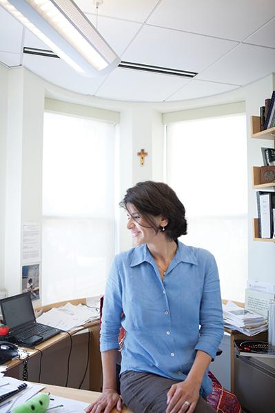
A pale yellow mantid sits with its long forelimbs bent as if in prayer, as still in death as it often was in life. Pinned to a board within a framed display that also includes beetles, saw-wasps, dragonflies, and other insect specimens, the mantid hangs on the wall of John Brownstein’s office in Boston Children’s Hospital’s innovation lab. Each insect is labeled with its genus and species along with the location in Kenya where it was collected.
Brownstein, who leads a team that has charted new territory in the use of maps for biomedical research, for public health surveillance, and for guidance in clinical medicine, collected the creatures himself. Early in his career, he had an interest in entomology and ecology, interests that later ignited a curiosity about insects as disease vectors. That line of inquiry led him to mapping and geographical information systems. Now he’s an HMS professor of biomedical informatics and the chief innovation officer at Boston Children’s.
“Geography and health risks are intimately related,” he says. “Mapping becomes the foundational concept to understand and communicate those risks.”
Some of the connections between health and location seem clear: close proximity to sick people increases one’s risk of getting sick, high levels of air pollution go hand in hand with an increased incidence of asthma, and poor health outcomes exist among people living in areas with few or low-quality medical services and limited access to healthy food.
Other connections are more surprising. In a study published this year in Nature Climate Change, Brownstein found that an increased resistance to antibiotics was linked to rises in temperature and population density.
In 2006, Brownstein led the team that built HealthMap, the first application to combine data from different sources for use in public health. The tool, says Brownstein, uses open-source software and is designed to be used in a variety of ways.
HealthMap tracks the incidence of various conditions in humans and animals—from infections linked to Acinetobacter baumannii to pregnancy complications linked to the Zika virus—and monitors other health-related factors like climate and pollution. Software and algorithms generate and update online maps using data drawn from news sources, social media, and other publicly available resources. Brownstein says the tool is being used for everything from outbreak surveillance by global and national health agencies to decision making by physicians in clinics. If a patient who has traveled internationally comes in with a respiratory complaint, her physician can check the map to see if there are outbreaks of respiratory conditions in the region she visited.
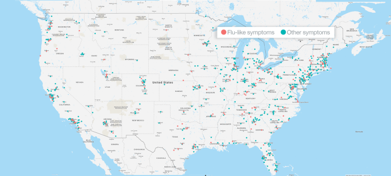
While HealthMap depends on data from governmental and nongovernmental sources that can be found online, some of the tools Brownstein has helped develop use geotagged, crowd-sourced data. He notes that the self-reported data that powers the website Flu Near You, for example, details flu’s incidence—with high geographic and temporal resolution—at a much lower cost than traditional surveillance methods. In addition, these crowdsourced tools, he says, put “the ‘public’ back in public health” and provide those who supply the data with heath surveillance news that is customized to show their local risk. This, Brownstein says, adds value for the users and deepens their engagement with the process.
Trip advisor
Jeffrey Blossom, who grew up hiking with printed maps in hand, loves to sit with friends around a big paper map, laying out a backpacking trip or identifying little-known pockets of slickrock for mountain biking in the Utah backcountry. He also loves helping researchers build and use digital maps to explore their data.
Knowing where things are happening is an important part of knowing how and why they’re happening, Blossom says. Just like people, the factors that affect health, climate, and the rise and fall of civilizations are unevenly distributed across the globe.
“Seeing how these factors relate to one another enables you to understand more about whatever you’re studying,” he says.
Blossom is the GIS service manager in the Harvard University Center for Geographic Analysis. He teaches cartography and spatial analysis to Harvard students, postdocs, and researchers and helps members of the Harvard community use geographic information systems and maps to better communicate stories with data.
“We’re in a geospatial revolution,” Blossom says, referring to the quantities of mappable data available from traditional sources, such as federal, state, and municipal governments, and the growing amount of data available from new sources, including crowdsourced and commercially generated databases. While much of the latter may have been collected for marketers, that data—grocery store locations, vitamin supplement purchasing behaviors, and frequency of visits to a doctor, for example—often have applications for social scientists and health researchers.
A map does not need to include multivariate analysis to be useful for health interventions, Blossom notes. In the 2014-2016 Ebola outbreak in West Africa, people in affected communities used OpenStreetMap, a crowdsourced web tool, to map villages not included in commercial mapping products and not visible to imaging satellites because of thick forest canopy.
“It wasn’t even disease mapping,” says Blossom. “They used the tool to map the roads that would allow first responders to get to where people needed help.”
Blossom worked with Lauren Fiechtner, an assistant professor of pediatrics at Massachusetts General Hospital, to produce an interactive map of Boston showing the locations of healthy eating options and places to play and exercise. The maps were used by health coaches working with the families of children dealing with overweight and obesity.
Because most people habitually follow the same routes to and from home, work, and school, and shop in a fixed subset of stores, they often aren’t aware of resources that may be available just a block or two off their beaten paths. In a community case study published in Preventing Chronic Disease, Fiechtner reported that the health-coaching maps Blossom helped produce increased parental feelings of empowerment. In addition, 76 percent of families who had access to the maps were physically active at new places and 57 percent shopped at new locations during the study’s one-year intervention period.
Street sense
Like scattered dots on a map that begin to reveal an obvious pattern at the right scale, the insights gleaned from mapping the spatial dimension of disease can make a big difference in health. For that reason, Brownstein is working to fundamentally change the way the biomedical world thinks about geography. In keeping with physicians who practice social medicine or who study socioeconomic disparities and maintain that you can learn more about the health of a patient by studying their zip code than you can by studying their genetic code, Brownstein wants the idea of geography as a crucial research and clinical tool to become central to mainstream medicine.
“We’re just going to keep beating the drum that location needs to be at the core of clinical practice,” he says.
Jake Miller is a science writer in the HMS Office of Communications and External Relations.
Images: Wikimedia/Public Domain/Mattias Paludi (top); John Soares; Mattias Paludi (flu near you)